Your Design System Has a New User. It's a Machine
AI tools now read our names, tokens, and docs to generate work. A design system written for humans alone gets misread. Here's how to make yours legible to both.
The Zip Code That Wouldn't Map
A while back I built a small Figma plugin called Insert Map. You type in a zip code, pick a provider — Esri, Google Maps, or Mapbox — and a basemap lands on your canvas. It's a simple idea. Building it was not.
The geocoding call worked everywhere except inside Figma. The plugin sandbox, it turned out, had opinions. Network calls had to live in one file and not the other. Utilities I took for granted simply weren't there. Image data had to be flattened into plain arrays before it could cross from one side of the plugin to the other. Even the list of allowed domains failed silently until I added https:// to each one.
None of these rules were unreasonable. What struck me was how literal the sandbox was. It did exactly what I wrote, not what I meant. Every fix came down to the same thing: saying it more precisely.
A New Reader at the Table
Somewhere in the middle of that debugging, I realized our design systems now have the same kind of reader.
AI tools are no longer just generating pictures of interfaces. They read our component names, our variables, our documentation — and then they build from them. In Figma, in code editors, in agents that scaffold whole pages. The design system has quietly become an input, not just a reference.
A human designer fills gaps with context. They know the amber button is the call to action because they were in the meeting where that was decided. A model has no meeting. It fills gaps with guesses.
Here's a small example from Modern Web Starter, the starter kit I maintain. It has a token called --color-amber-500. It also has one called --accent-default, which points to that same amber. To a person, the difference is minor. To a model, it's everything. The first tells it what a color is. The second tells it what the color is for.
In Why Product Designers Need Markdown Now, I argued that Markdown matters because it's the format AI reads natively. This is the same argument, one layer down. If Markdown is the format, the design system is the vocabulary.
Design It Like an API
Engineers already have a name for an interface that a machine has to read without guessing. They call it an API.
A good API earns trust through a few unglamorous habits. Its names are consistent and predictable. Its inputs are typed, so you can't hand it the wrong kind of thing. It's documented, so you don't have to read the source to use it. And it's versioned, so it can change without breaking everyone who depends on it.
None of that is new to design systems. We've talked about naming conventions and documentation for years — usually as hygiene, the kind of thing you get to after the real work. What's changed is the consequence. When a design system is ambiguous, it no longer just slows down a new teammate. It produces confident, wrong output at scale.
So the reframe is simple: treat your design system as a contract with every tool that reads it, human or not.
Five Practices for a Legible System
I'll use Modern Web Starter as the worked example throughout. It's small enough to see whole, and it was built with this reader in mind.
1. Name for Meaning
The starter's buttons come in four flavors: Primary, Secondary, Accent, and Ghost. Not Black, Outline, Amber, and Text. Each name describes a role in the interface, which means it still makes sense when the colors change — and it gives a model something to reason with. Ask it for "the main action on this page" and Primary is an obvious match. Ask it to match "Black" and it has no idea whether that's a decision or an accident.
The test I use: if you rebranded tomorrow, would the name still be true? If not, it's describing appearance, and appearance is the one thing guaranteed to change.
2. Tokens as Intent
Modern Web Starter uses three tiers of tokens. Primitives hold raw values — --color-amber-700 is just a color. Semantic tokens map purpose to those primitives — --accent-fg says "this is the accessible amber for text and foreground use." Component tokens scope that purpose to a single element — button/accent/bg.
The tiers aren't bureaucracy. They're how intent travels. Dark mode, for instance, lives entirely at the semantic tier: --accent-fg points to amber-700 in light mode and amber-400 in dark. Nothing downstream has to know.
One honest admission: when I mirrored these tokens in Figma for this article, I found the button tokens only exist on the design side. In code, the buttons reach straight for semantic tokens. That's a small gap, but it's exactly the kind a machine will trip over — two sources of truth that almost agree.
3. Write the Spec Down
The starter's repository includes a CLAUDE.md file that documents every convention: the layer order, the token tiers, what each primitive is for and when not to use it. It exists so that AI assistants can contribute to the codebase with full context instead of inferring it.
Figma has a quieter equivalent that most of us leave blank: the component and variable description fields. A sentence like "Use for the single primary action on a page; never more than one per view" is documentation for your teammates and a spec for any tool that reads the file.
4. Make Structure Explicit
In CSS, the starter declares its cascade layers exactly once — reset → tokens → base → components → utilities — so specificity conflicts become a solved problem rather than a guessing game.
The Figma version of this is Component Properties. A button with a real Size property and a real Variant property can be read and set by a tool. A button that changes size because someone hid a layer and nudged some padding can only be imitated.
5. Connect Design and Code
The last step is making sure both sides use the same names. In the Figma file I built for this piece, every variable carries its CSS name as code syntax — accent/fg in Figma knows it is var(--accent-fg) in code.
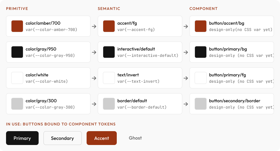
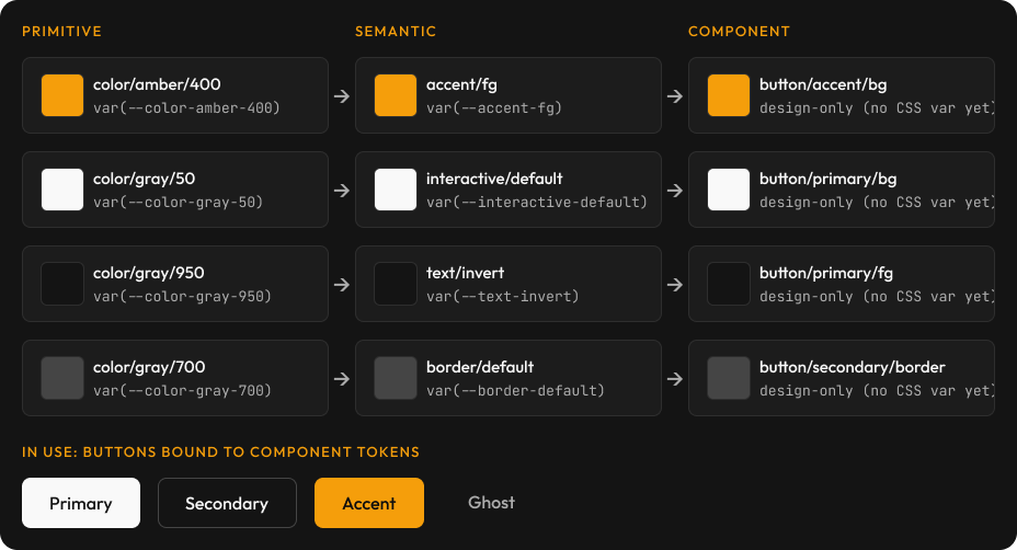
Each row is one chain, from raw value to purpose to element. The buttons at the bottom are bound to the component tokens — change a primitive and everything downstream follows.
With names aligned, tools like Code Connect can close the loop, so a component in Figma and a component in code share a single contract rather than two descriptions that drift apart.
Draw the No-Fly Zones
Precision cuts both ways. A legible system tells a machine what it can do; a mature one also tells it what it shouldn't.
When I think about where AI belongs in the design process, the most useful output is rarely the list of things to automate. It's the short list of things to protect. The brand-defining moments — a hero, an onboarding flow, the first screen a customer ever sees. Accessibility decisions that require judgment about real people, not just a contrast ratio. Anything where the right answer depends on context the system can't hold.
Write those boundaries into the system itself, the same way you'd write a deprecation notice into an API. A line in a component description — "Hand-composed; do not generate variants" — is a small thing. It's also the difference between a tool that helps and a tool that confidently overreaches.
A Five-Minute Audit
You don't need a migration project to start. Pick one component — a button is ideal — and ask five questions:
- Does its name describe a role, or an appearance?
- Do its colors come from semantic tokens, or straight from primitives?
- Does it have a description a stranger could act on?
- Are its variations real properties, or hidden-layer tricks?
- Does its name in Figma match its name in code?
Every "no" is a place where a machine will guess. Fix one, and you've made the system better for your teammates too — which, as with most good craft, was always the point.
The fix for my zip code bug was never cleverness. It was precision. Design systems are no different. Say what you mean, in a way that can't be misread — because increasingly, the reader on the other side won't ask a follow-up question.